Album Campaign:
Case Study /
Xxxxxx xxxxxx xxxxxx xxxxxx xxxxxx xxxxxx xxxxxx xxxxxx xxxxxx xxxxxx xxxxxx xxxxxx xxxxxx xxxxxx xxxxxx xxxxxx xxxxxx xxxxxx xxxxxx xxxxxx xxxxxx xxxxxx xxxxxx xxxxxx xxxxxx xxxxxx xxxxxx xxxxxx xxxxxx xxxxxx xxxxxx xxxxxx xxxxxx xxxxxx xxxxxx xxxxxx .
The Script / Freedom Child
Freedom Child by The Script is a perfect example of the kind of creative partnership I value most — one built on trust, shared ideas and a belief in a common vision.
When approaching any large-scale campaign, I look for a single defining image, something distinctive enough to carry across formats and evolve into a complete visual language.
During an early meeting at the band’s London studio, Danny O’Donoghue, The Script’s lead singer, showed me a photo on his phone. It was a striking image: a young girl standing face to face with a line of armed police in full riot gear.
“So, the album’s called Freedom Child,” he said. “Is this girl our mascot?”
It was a powerful place to start, but we both knew that such a politically charged image might not sit comfortably with the band’s audience. The question became how to express the spirit of freedom — the right to push back, to challenge — without taking an overtly political stance.
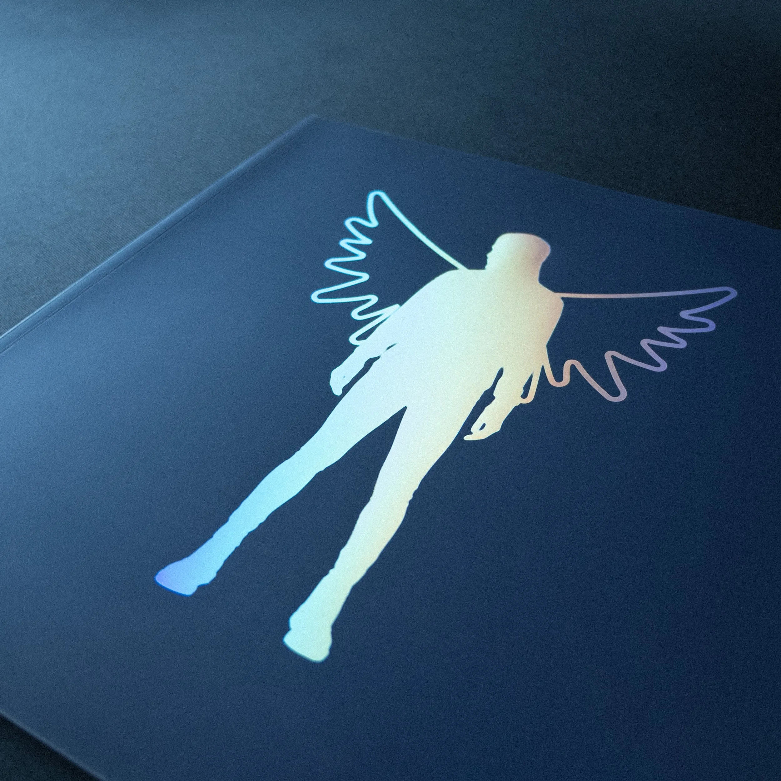
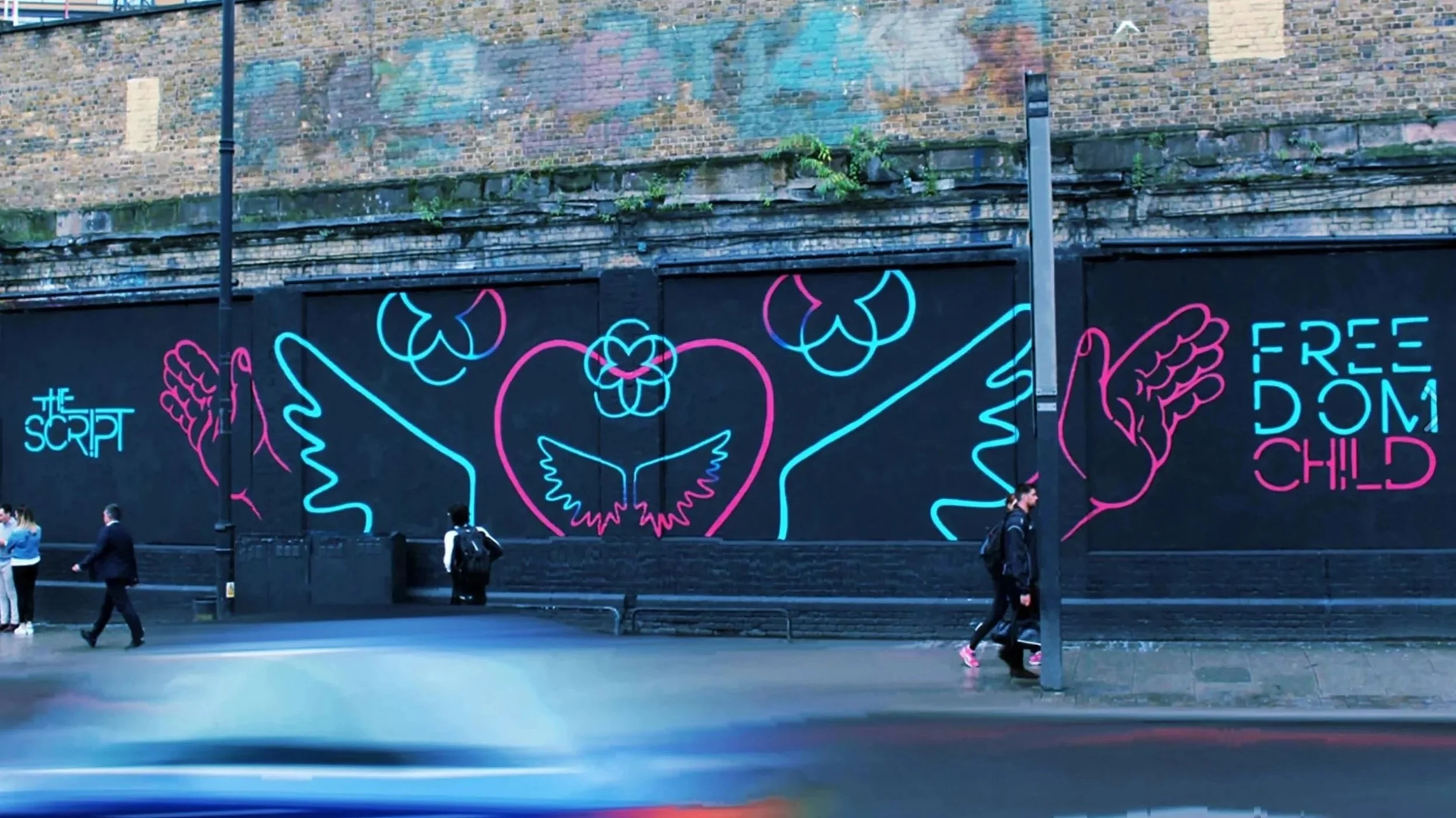
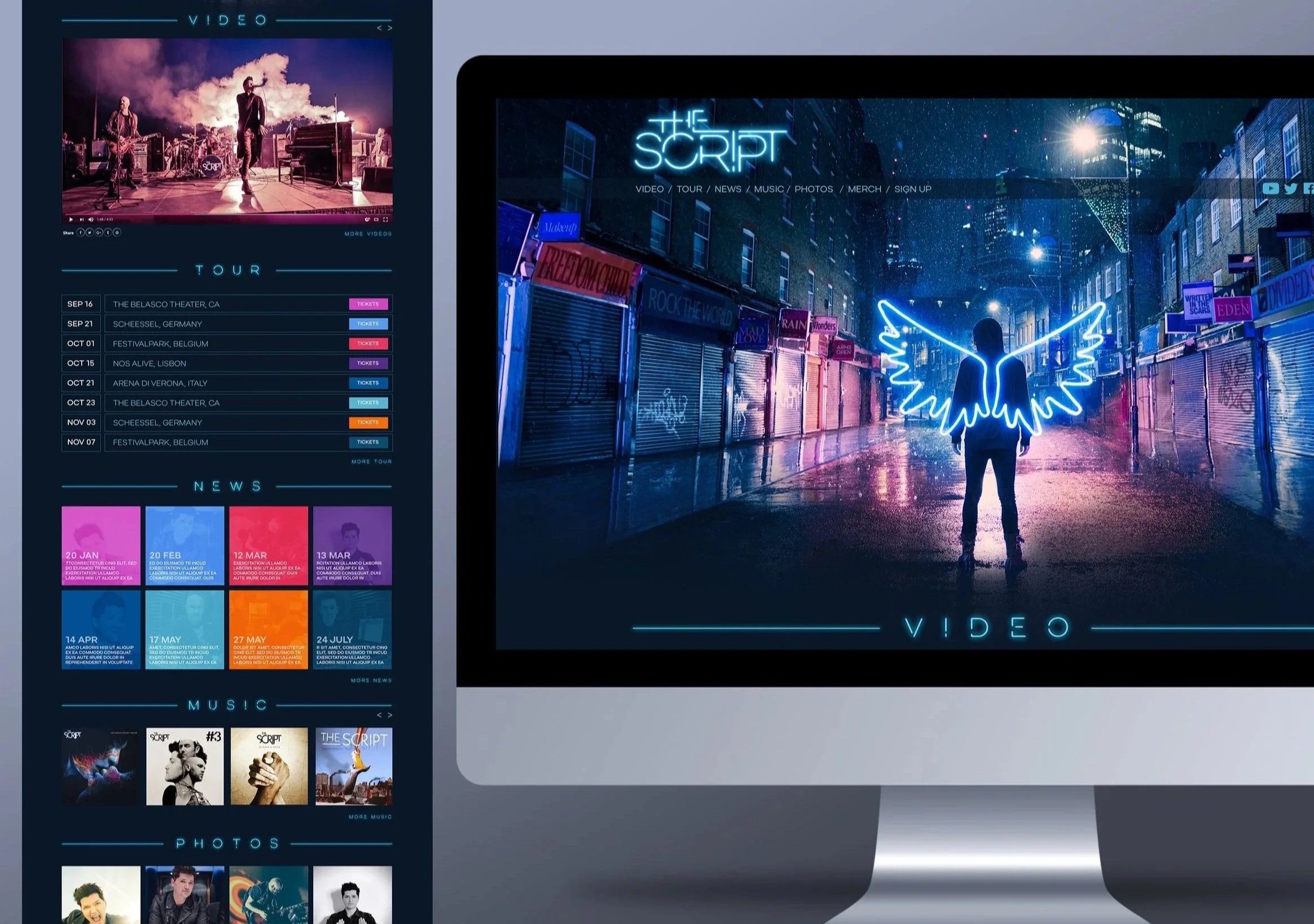
We began to unpack the idea of ‘freedom’ through a series of sketches and visual explorations: an open hand, a lotus flower, a light bulb, a brain, a heart, a dove, angel wings. The wings stood out immediately. The band could see how they might become a central motif, adaptable across video, stage and merchandise.
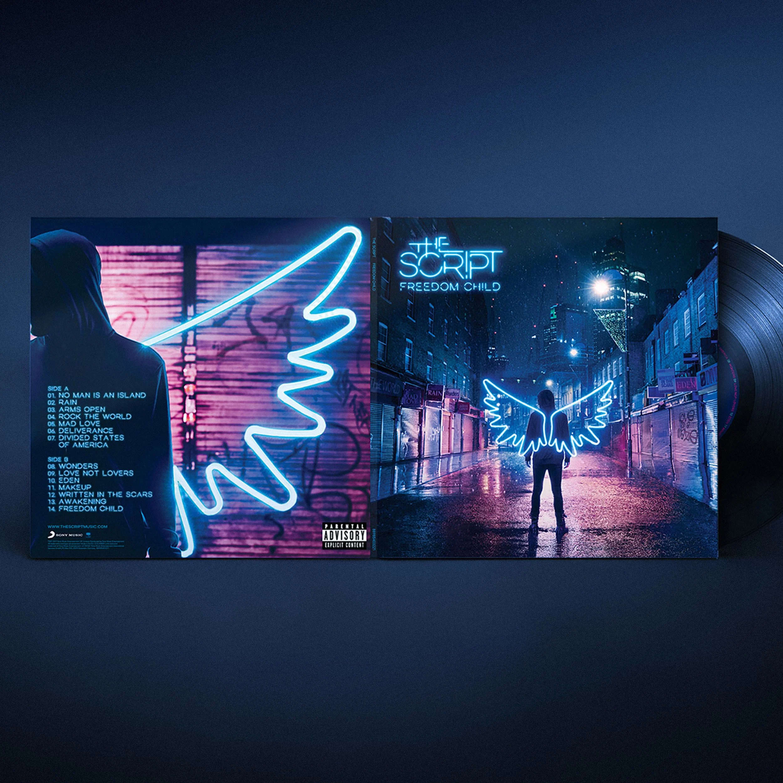
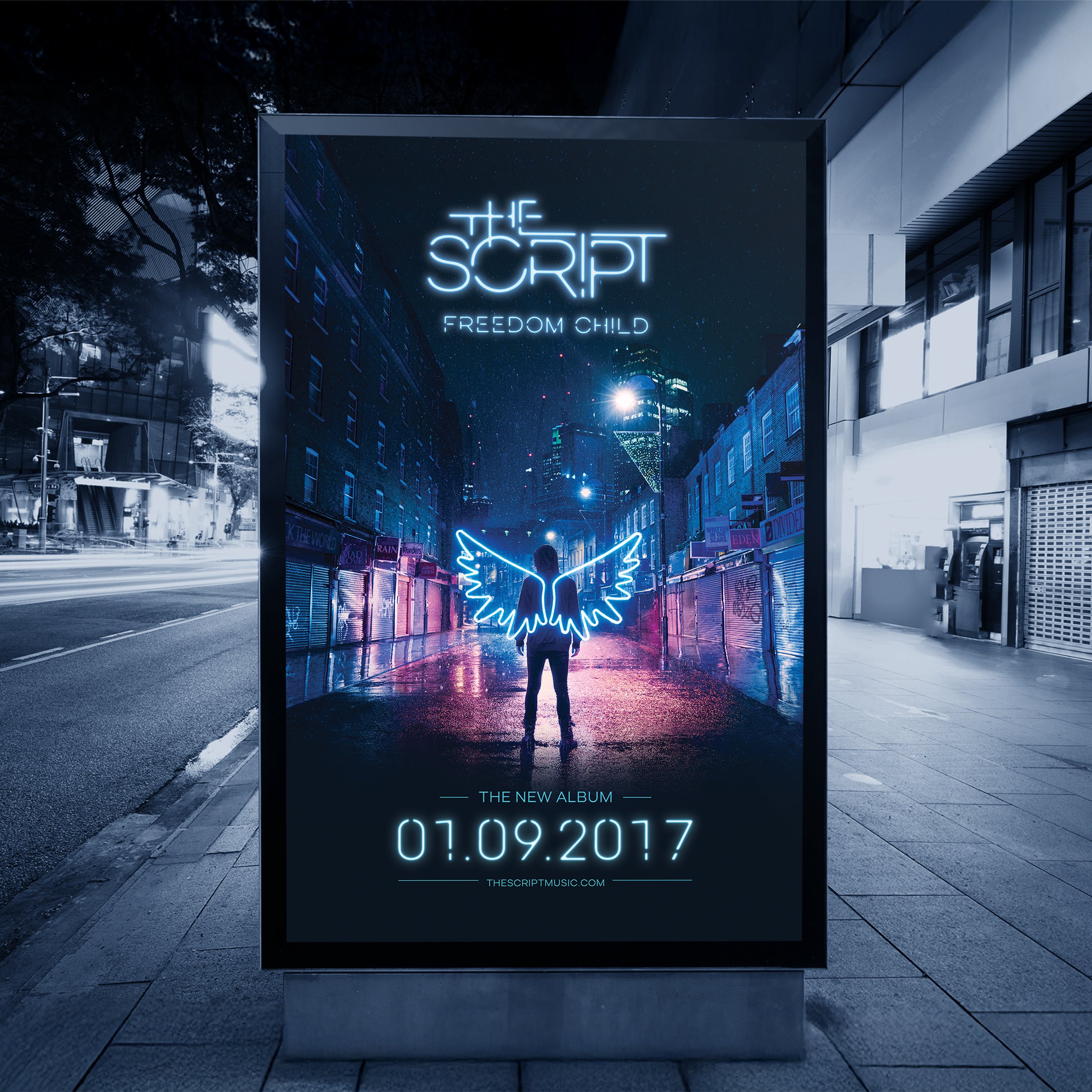
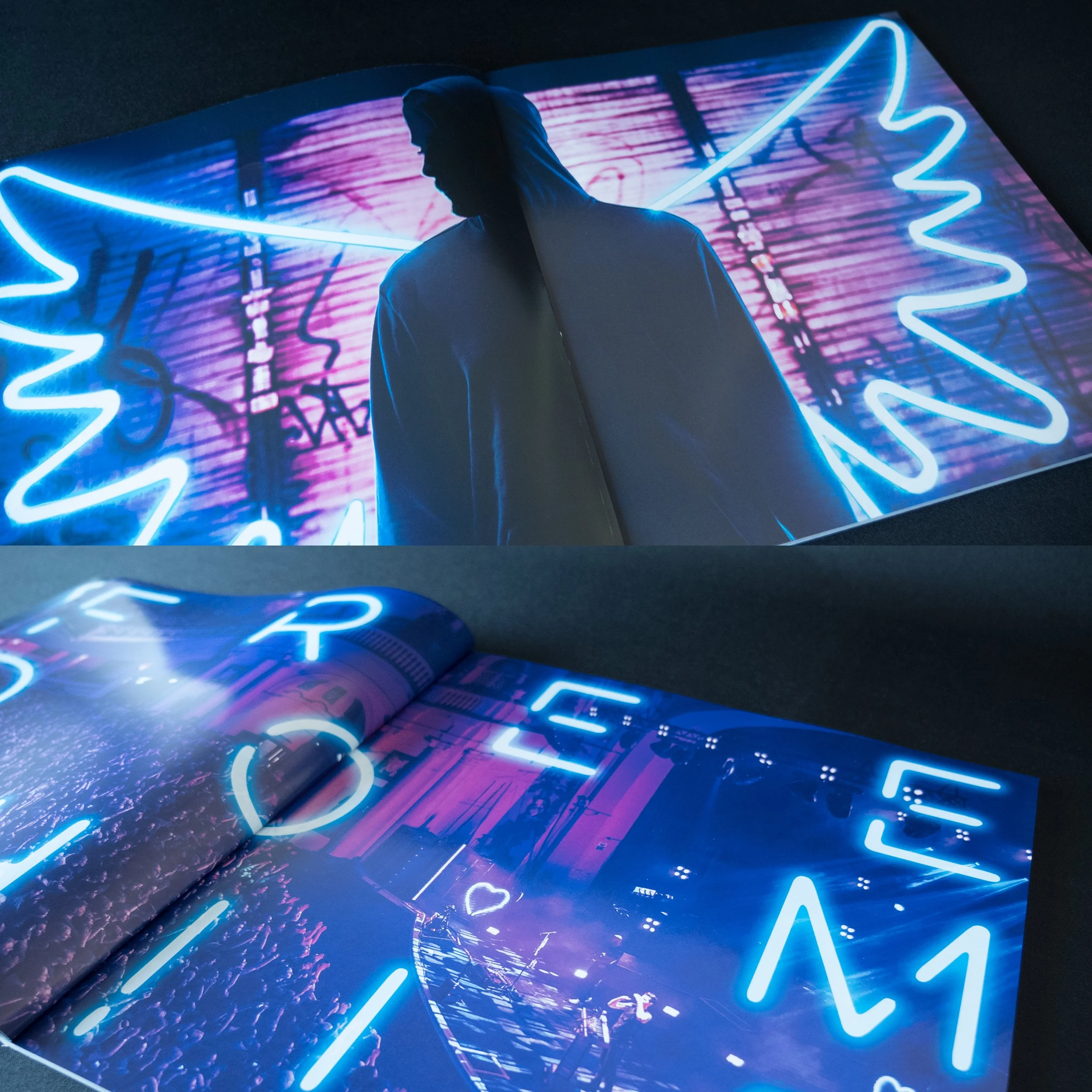
That became our turning point. We introduced the idea of neon, and gradually the concept took shape. The innocent child from the original photograph evolved into a solitary figure — our ‘Freedom Child’ — standing on a rain-soaked city street, glowing wings on his back. It felt cinematic, hopeful and charged with emotion.
Realising the image took careful planning. We scouted for the perfect London location, built full-scale neon wings, created miniature models to test the setup and then shot through the night in Petticoat Lane Market. It was cold, wet and chaotic, but when the final image came together — glistening pavements, reflections and light — it captured exactly what we’d imagined.
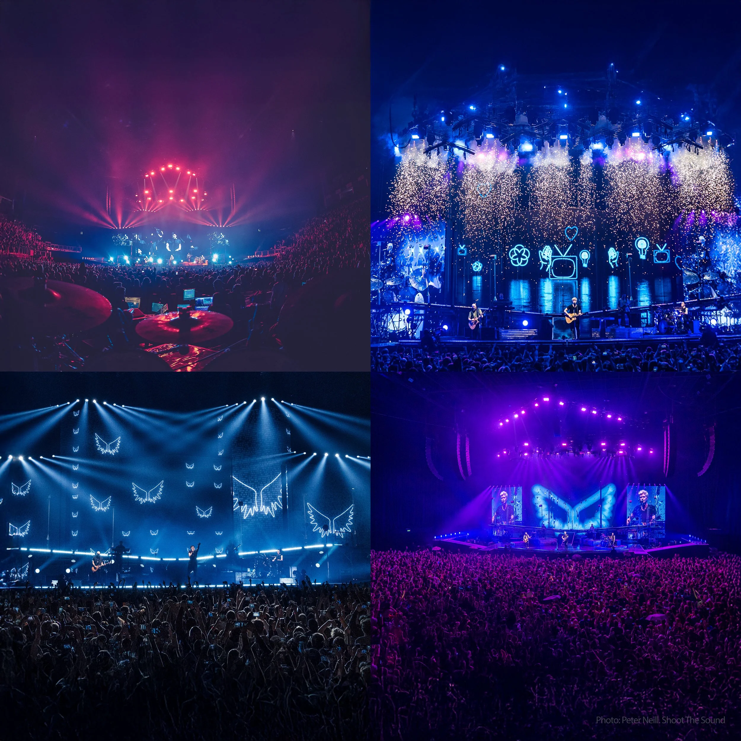
That photograph became the foundation of the entire campaign — the album artwork, tour identity and promotional visuals. I developed a bespoke neon-inspired typeface, a vibrant colour palette and a suite of supporting graphics to unify the look and feel across every platform.
Alongside the album design, I also art directed the advertising, merchandise, online assets, posters and tour visuals — all drawn from that same glowing sense of energy, defiance and hope that defined Freedom Child.
Testimonials
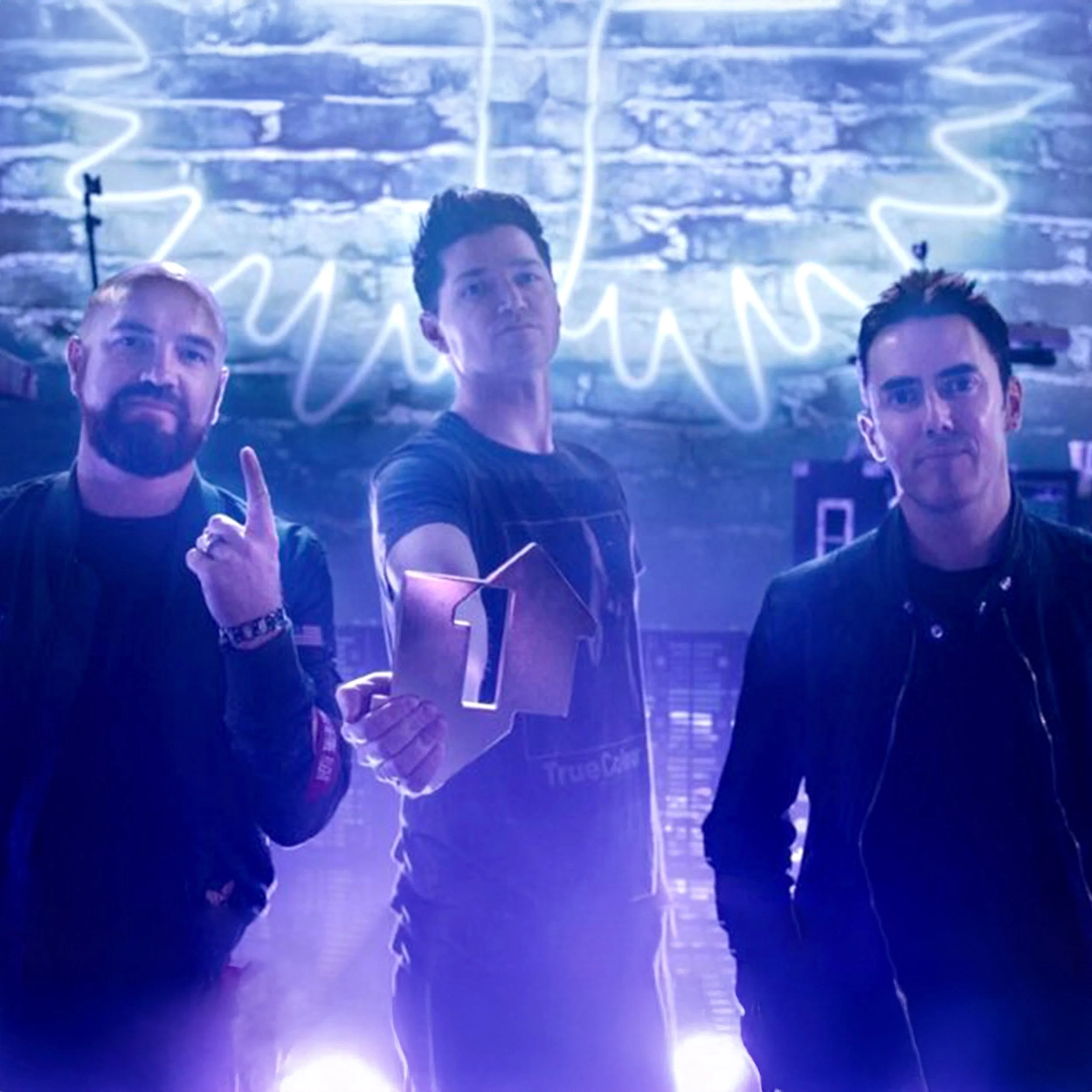
“Gary has done a phenomenal job on Freedom Child. The lengths he goes to, and the sheer passion for completing a vision in full, are what sets him apart from the rest. He doesn’t just run with an idea, he flies. He has always been an integral part of our design team, bringing our visions to life and also taking us in directions we never envisioned ourselves. Gary is a true collaborator in every sense of the word and we love working with him.
Danny O’Donoghue
The Script
“Gary is always incredibly dedicated to producing work of the highest standard. He is very collaborative with both artist and label and consistently delivers everything we need ahead of our tight deadlines.”
Bec Adams
Senior Marketing Manager, Columbia Records