The Script - Freedom Child
Album Campaign Branding Case Study
––––


The Script - Freedom Child
‘Freedom Child’, by The Script, is a real example of the sort of relationship I enjoy with my clients – a sharing of ideas and a belief in one another’s vision.
When considering any large packaging and identity campaign, I look for a unique image, a special element that will translate and evolve across all media.
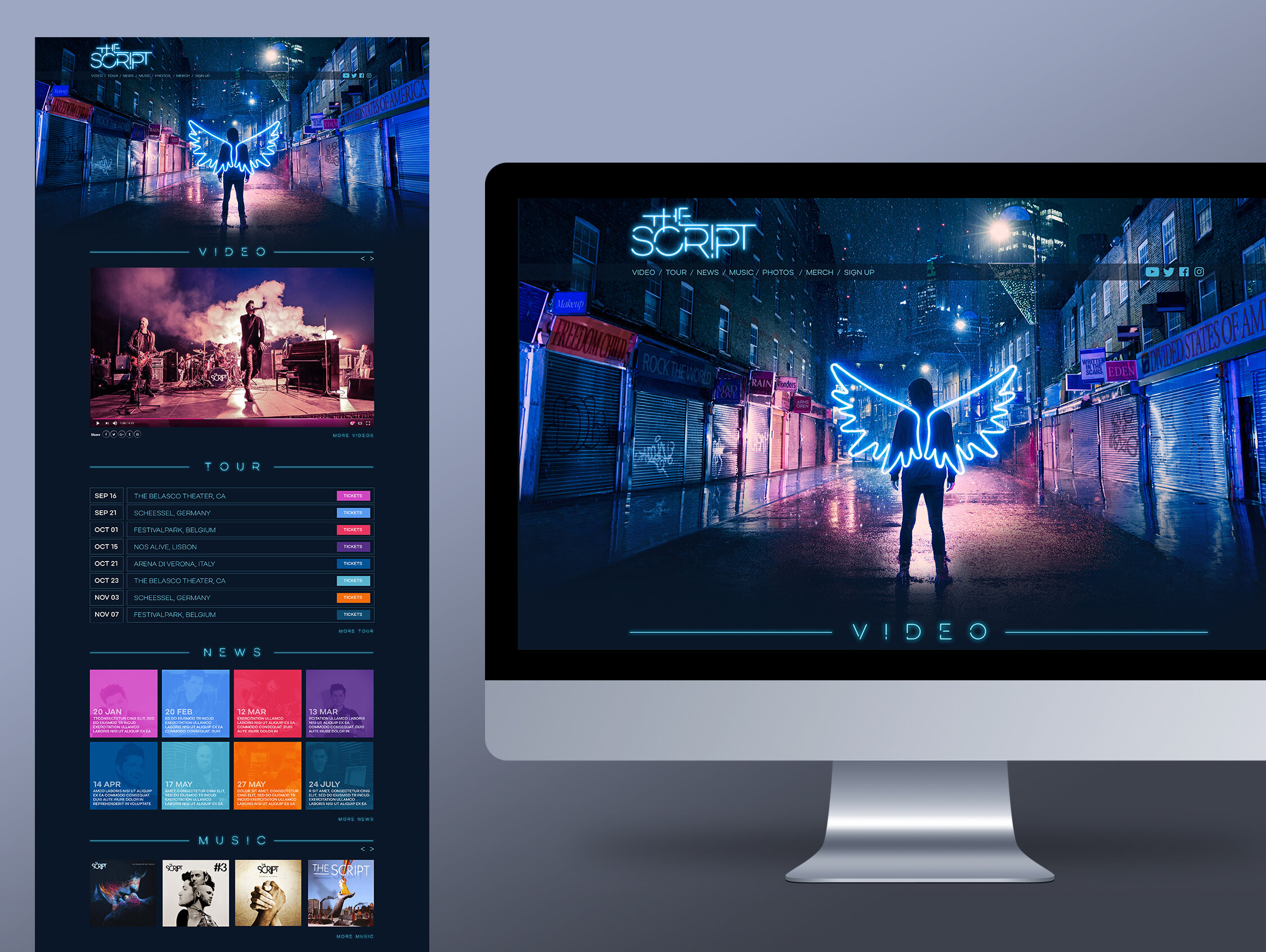
Arriving at the band’s studio in London to discuss the upcoming album, Danny O’Donoghue, the band’s lead singer, shows me a powerful image on his phone. It’s an image young girl, standing facing a line of armed police in full riot gear. Danny says, “So, the album is called Freedom Child, is this girl our mascot?” It was fantastic, but it was going to be a challenge selling such a politically charged image. The Script’s success hasn’t been built on grandstanding political statements. We needed to find a way to communicate the album’s themes of freedom and the right to push back against oppression, in a graphical but apolitical way.
We focused on the word ‘Freedom’ and its connotations, sharing sketches, doodles and notions along the way: an open hand, a lotus flower, a light bulb, a line drawing of the human brain, a heart, a dove, a pair of angel’s wings and so on. The band were positive, particularly about the angel wings. They immediately saw the branding potential, across videos, staging and merchandise. We also explored neon light along with the wings and gradually, the image of a solitary figure on a dark, rainy, urban street began to emerge. It wasn’t our innocent child any more. Somehow we’d settled on a young man, our Freedom Child, viewed from behind, with the angel’s wings on his back. It illustrated our narrative perfectly.
Now came the challenge of creating and shooting the image. This involved finding the ideal street, manufacturing a complicated life-sized set of wings for the angel character and making small-scale models. Then there was a difficult night shoot in London’s Petticoat Lane market – in the pouring rain – followed by lots of digital superimposing in the studio. The results were worth it. The final composition glistens with down-pouring rain and luminosity – we had our unique image!
This image became the avatar, the identity for the album campaign and tour. I even developed a bespoke neon Vegas-styled typeface, a full neon colour palette and various supporting graphics.
In addition to the album design, I was responsible for advertising, merchandising, online, posters and graphics.
You can view more samples of The Script work here>>
Testimonials
“Gary has done a phenomenal job on Freedom Child. The lengths he goes to, and the sheer passion for completing a vision in full, are what sets him apart from the rest. He doesn’t just run with an idea, he flies. He has always been an integral part of our design team, bringing our visions to life and also taking us in directions we never envisioned ourselves. Gary is a true collaborator in every sense of the word and we love working with him.”
Danny O’Donoghue
The Script
“Gary is always incredibly dedicated to producing work of the highest standard. He is very collaborative with both artist and label and consistently delivers everything we need ahead of our tight deadlines.”
Bec Adams
Senior Marketing Manager, Columbia Records
If you have a project in mind, drop me a line, I’d love to chat. hello@igarykelly.com
Freedom Child - Sony Music Album Graphic Design - Branding - Poster Design - Art Direction - CD Cover Design - Vinyl Album - Band Logos - Artwork - Agency - Web Design